Centre for Grower-centric Eco-value Mechanisms
01 · Brand Overview & Strategy [FOUNDATION]
C-GEM operates legally as the Eco-Value Empowerment Foundation. It is India's only non-profit accountability partner for smallholder farming communities in carbon and ecosystem markets.
Carbon markets pay landholders for sequestering carbon, restoring ecosystems, and protecting forests — but those markets are complex, opaque, and designed for corporate intermediaries. C-GEM sits between farming communities and that market: reviewing contracts, negotiating terms, and ensuring fair benefit-sharing on the credits generated.
Farmers First
To tip the scale in favor of grassroots farming families by shielding them from predatory contracts and enabling direct access to planetary climate finance.
Scale of Impact
2,71,000 farming families reached across 14 Indian states, with the support of our on-ground partners.
Moral Agency
Acting purely as an accountability and legal advisor on grower carbon credits — not an aggregator that trades in them.
Voice & Tone Principles
C-GEM's copy never reads like commercial marketing — it reads like an organization that has taken a moral position and is asking stakeholders to join.
- Stewards, not beneficiaries: Farmers are visual and verbal protagonists. They own, steward, and thrive, rather than "receive aid".
- First-person plural: Use "We" as a collective force. We stand with communities.
- Specific numbers: Always use the Indian numbering format (e.g. 2,71,000 instead of 271,000).
- Action verb anchors: Layout titles should use assertive verbs like PROTECT, BUILD, LEVERAGE.
- No commercial hype: Banish words like "revolutionary", "disruptive", "game-changing", and "unlock the future". Use "verifiable", "rooted", and "rights-based".
- No Emojis anywhere: Emojis (e.g., 🌱, 🤝, 🌍) degrade the audit-grade seriousness of the brand. Use real icons or typography dots.
- No lowercase "C-GEM": The brand name is always hyphenated, all caps: C-GEM.
- No cream backgrounds: The v1 cream color scheme is completely retired. The background is strictly pure white.
02 · Logo System [VISUALS]
Six cuts — Stacked, Logomark, Horizontal, Horizontal Alternative, Textmark, and Brushmark. Each logo cut except Textmark and Brushmark ships in four colourways. Use Full Colour on white or paper backgrounds only. Use White or Inverse on dark and photographic surfaces. The brushmark is a separate identity element — never substitute it for the logomark.
01. Stacked
Primary mark. Brushmark arc above wordmark, centred composition. Default choice for all formal contexts — covers, headers, stationery.

02. Logomark
Brushmark arc + C-GEM wordmark in compact composition. Three crop variants available — tight square, wide crop, and mid crop. Use when stacked or horizontal formats don't fit: app icons, favicons, profile images, square social crops. Black, white, and inverse colourway files are not yet in production; request from the design team before use on dark backgrounds.
03. Horizontal
Brushmark arc left, wordmark right. Preferred for navigation bars, document headers, and wide-format contexts where vertical stacking wastes space.

04. Horizontal Alternative
Square-format variant of the horizontal cut. Retains horizontal proportions in a contained frame — suited to co-branding lockups, partner certificates, and print contexts where a square crop is required.

05. Textmark
Wordmark only — no brushmark arc. Use exclusively in running text, footnotes, or body copy where the brushmark would be too small to read at the required scale (below 16px equivalent). Never use as a primary logo.
06. Brushmark
The brushmark arc is a standalone identity element — not a logomark variant. It is always green; never recolour, never use as a replacement for the full logo, never crop. Its three usage modes — background motif, hero anchor, and inline mark — are set out in full in Section 05 · Brushmark & Triplet.
Half the cap-height of "C-GEM" on all sides
Maintain a safety margin equal to at least the height of the brushmark arc. Avoid crowding headers, sidebar boundaries, or statutory footers.
Integrity rules — non-negotiable
Do not recolour the brushmark arc. Do not place Full Colour on coloured, patterned, or photographic backgrounds — use White or Inverse. Do not crop, stretch, skew, or rotate any cut. Minimum digital size: 80px wide. Minimum print size: 18mm wide.
03 · Color System [PALETTE]
Pure white is the only page ground. Leaf Green anchors the brand in both skins. Two shock accents — Sprout and Lime — appear sparingly as data highlights, never as decoration.
01. Surface & Ink Tokens
02. Leaf Green Scale (Brand Core)
03. Programme Accents & Data Highlights
04. Data Highlights
04 · Typography & Casing [TYPE]
Our typography adapts to our audience. The warm **Marketing skin** uses Geist paired with Newsreader Italic for community narratives. The clinical **Platform skin** enforces Space Grotesk + JetBrains Mono for verifiable ledger details.
- 01 Display: Geist Normal, 500 weight, -0.04em tracking, tight line-height (0.93)
- 02 Body: Geist Normal, 400 weight, 14.5–16px / 1.55 line-height, ink-mute color
-
03
Narrative Voice: Newsreader Italic, 400 weight, warm green color (
--leaf-700) - 04 Data/Meta: Geist Mono, uppercase, tracked wide for captions and indicators
See also: type-body, type-display, type-pairing preview cards.
- 01 Display: Space Grotesk, 500 weight, snug line-height (1.05)
- 02 Technical Voice: JetBrains Mono replaces Newsreader. Set in uppercase or monospace
- 03 Data/Meta: JetBrains Mono everywhere. Bracketed index numbers (e.g. `[01]`)
Interactive Typography Sandbox
Pick a type role and drop it on any surface in the palette — then flip the composition mode in the sidebar to watch the whole sandbox change skin. Every combination stays inside the brand system.
Indian Numbering Format & Tabular Figures
All numerical statements representing families, hectares, or carbon credits must use the Indian numbering
format: 2,71,000 not 271,000. Apply CSS font-variant-numeric: tabular-nums to any data column to ensure clean audit layout.
Multilingual Moments — Devanagari
किसान पहले,
जलवायु हमेशा.
Noto Sans Devanagari pairs with Geist for any Indian-script artefact. Apply font-family: var(--font-devanagari) or the .deva class. The triplet — Farmers First · Climate Always — works in either script.
- Use Noto Sans Devanagari weight 600 for display-size Hindi text.
- Newsreader Italic pairs with Devanagari for bilingual pull-quote moments — the italic carries warmth across scripts.
- Never set Devanagari in a Latin-only font — it will render as tofu boxes.
- In platform skin, Devanagari text stays upright (no italic fallback needed — JetBrains Mono is Latin only).
05 · Brushmark & Triplet Usage [MARK]
The brushmark C is the only true icon in the system. It appears in three modes. The triplet is the brand's signature rhythm line — it runs across every surface, both skins.
Brushmark — Three Modes
Cap-x height beside the wordmark in navigation bars and document headers. Always green — never recolored.
Triplet Rhythm
The triplet is the brand's tonal signature. It runs across every surface in both skins. Three terms separated by leaf-green dots — never more than three, never as a bullet list.
Primary — used across all surfaces
Mission line — sidebar, footers, covers
Values line — annual reports, governance documents
- Always use the
.tripletclass — never hand-roll the dots or spacing. - Use uppercase tracking — the triplet is set in Geist Mono, tracked wide.
- Maximum three terms. Two-term versions (Farmers First · Climate Always) are valid.
- The dot separator is leaf-green (#2C7A3D) in both skins.
- Don't rewrite the triplet with four or more terms — it breaks the rhythm.
- Don't use the triplet as a bullet list or numbered sequence.
- Don't render it in a serif or body font — it must stay in
var(--font-meta). - Don't replace the dot separator with a slash, pipe, or dash.
06 · Illustration Library [ART]
We utilize documentary, warm-graded agricultural photography focusing on growers. When photography is not available, we apply strict vector constraints.
The C-GEM Illustration Library
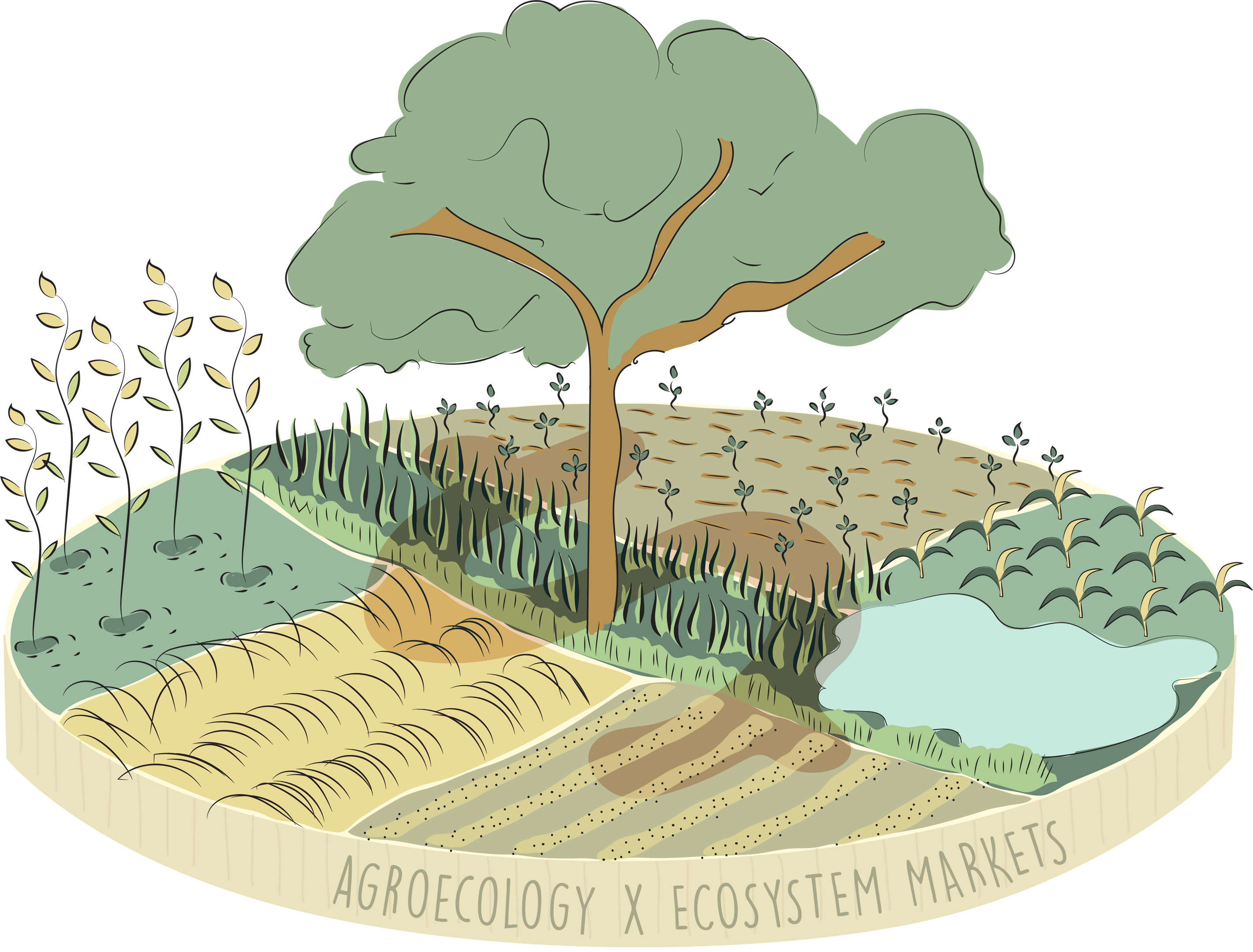
The Ambassador Coin
Our core narrative illustration, representing C-GEM’s model as an integrated micro-economy built on payments for environmental stewardship.
1. Coin Shaped Base
Reflects ecosystem payment flows and tangible asset creation for rural families.
2. Mixed Cropping & Central Lake
Represents structural agroforestry, soil water retention, and diverse crop yields.
3. Shadowed Dollar Sign ($)
Faded in the center of the coin base, symbolizing carbon markets serving as the support system underneath grower livelihoods.
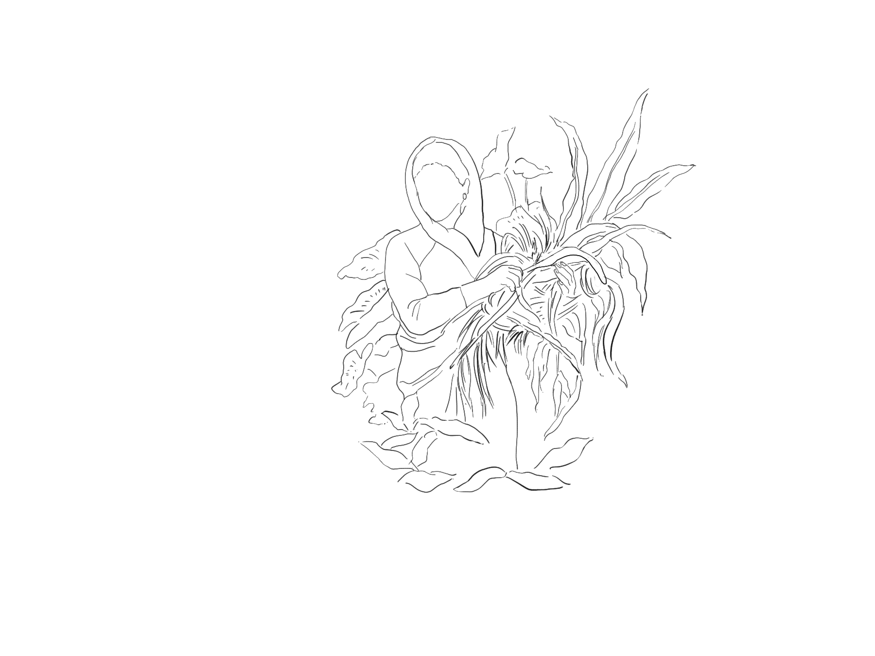
Additional Illustration Assets





07 · Photography [PHOTOS]
C-GEM photography is unposed and truthful — field conditions, working hands, the actual landscape. Avoid stock. Shoot in natural light, resist heavy filters. The palette will do the cohesion work.
Growers, field conditions, working moments — never posed portraits or abstract nature shots.
Natural light, warm-neutral tones. The earthy reds and greens of real fields echo the brand palette naturally.
When placing text on photos, use a dark scrim at ≤ 55% opacity — never a solid colour block.
Photo Library
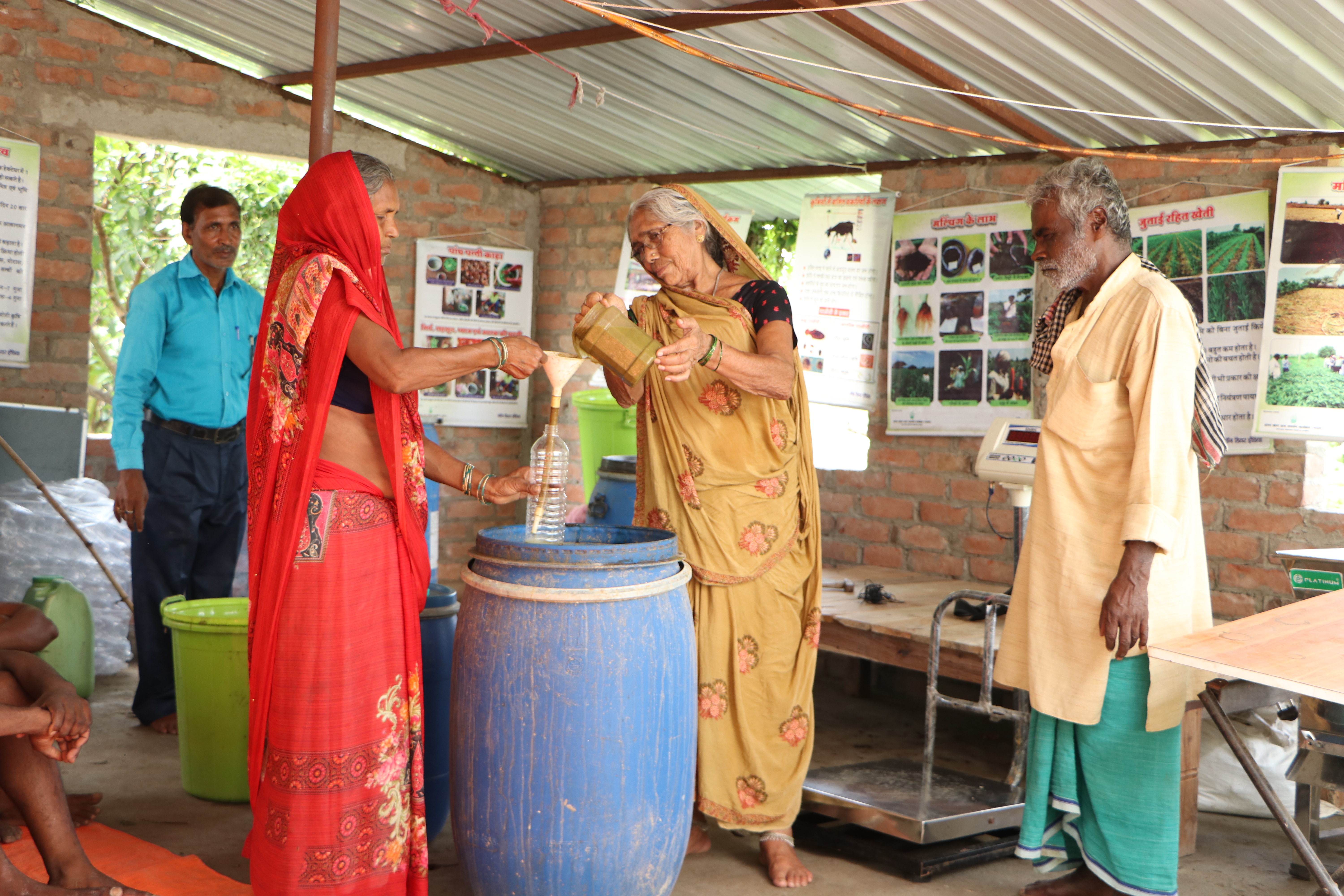
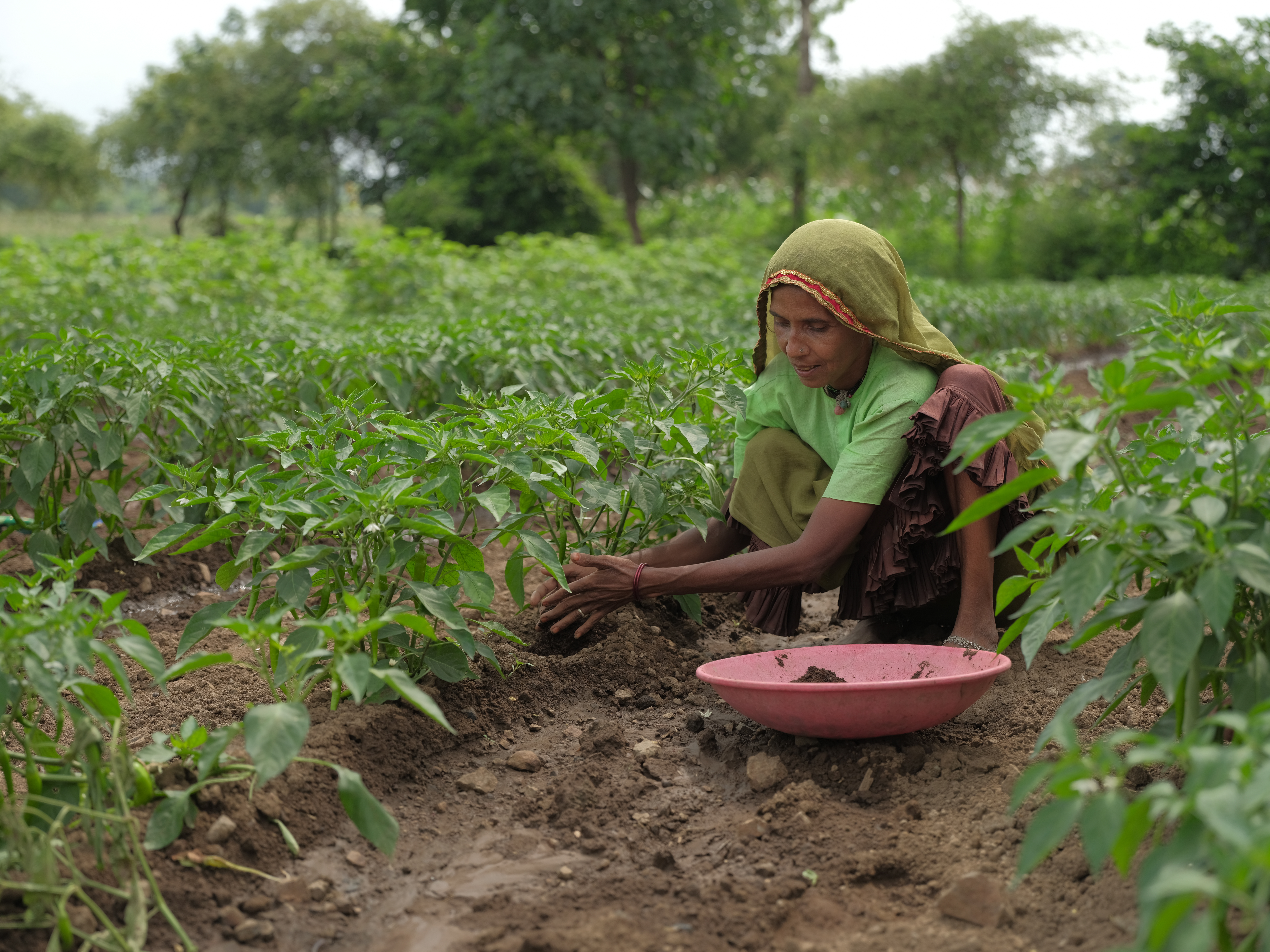
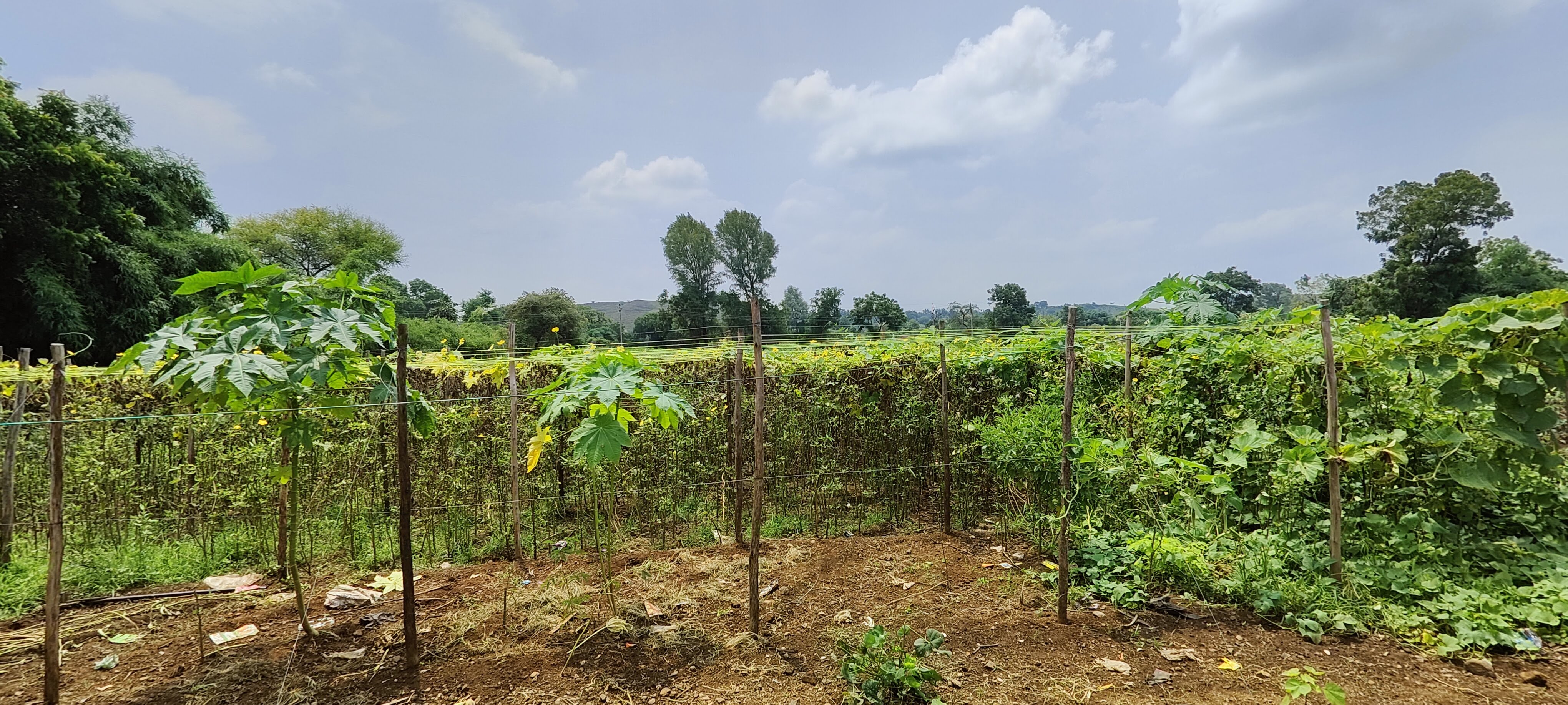
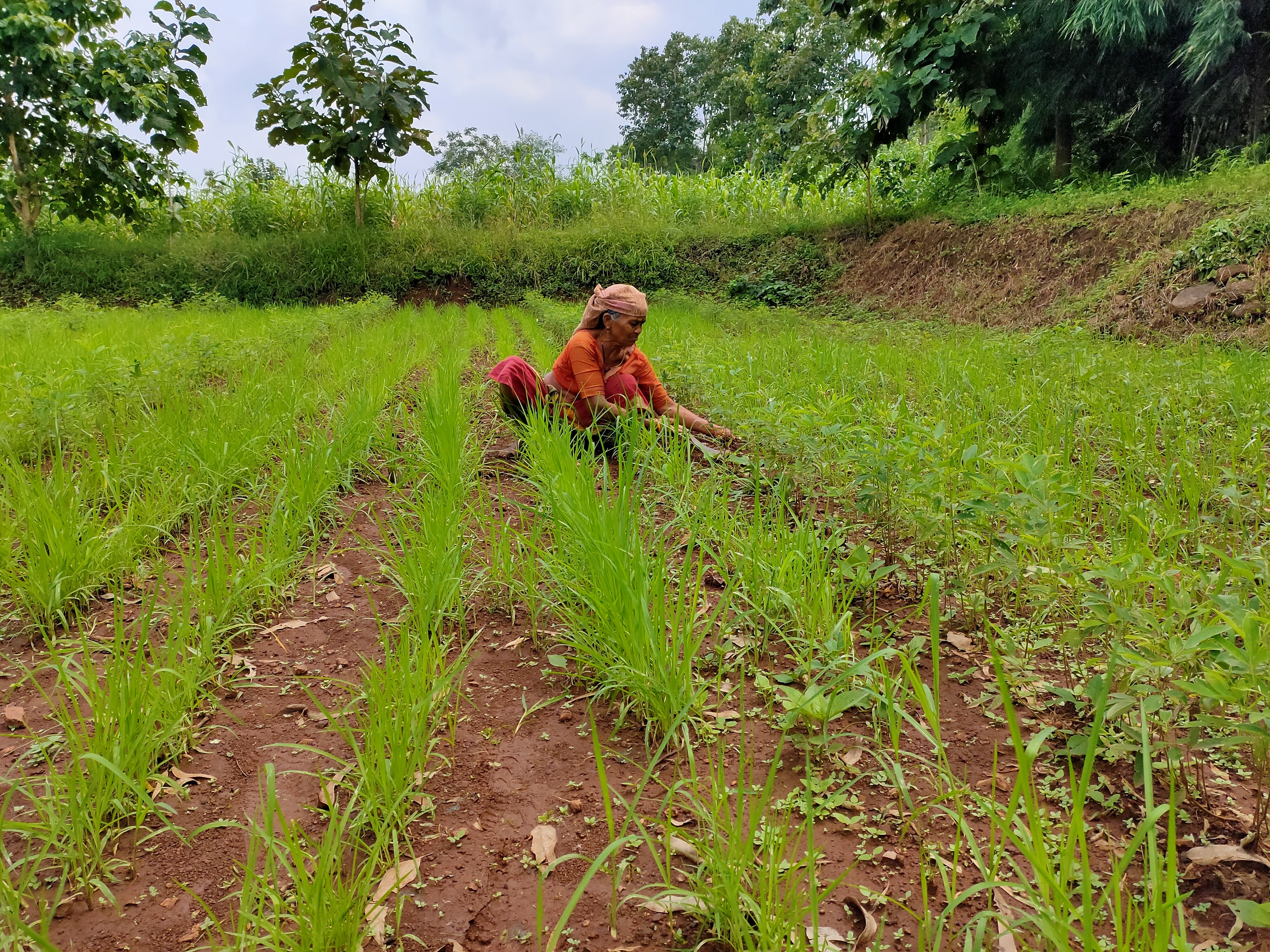
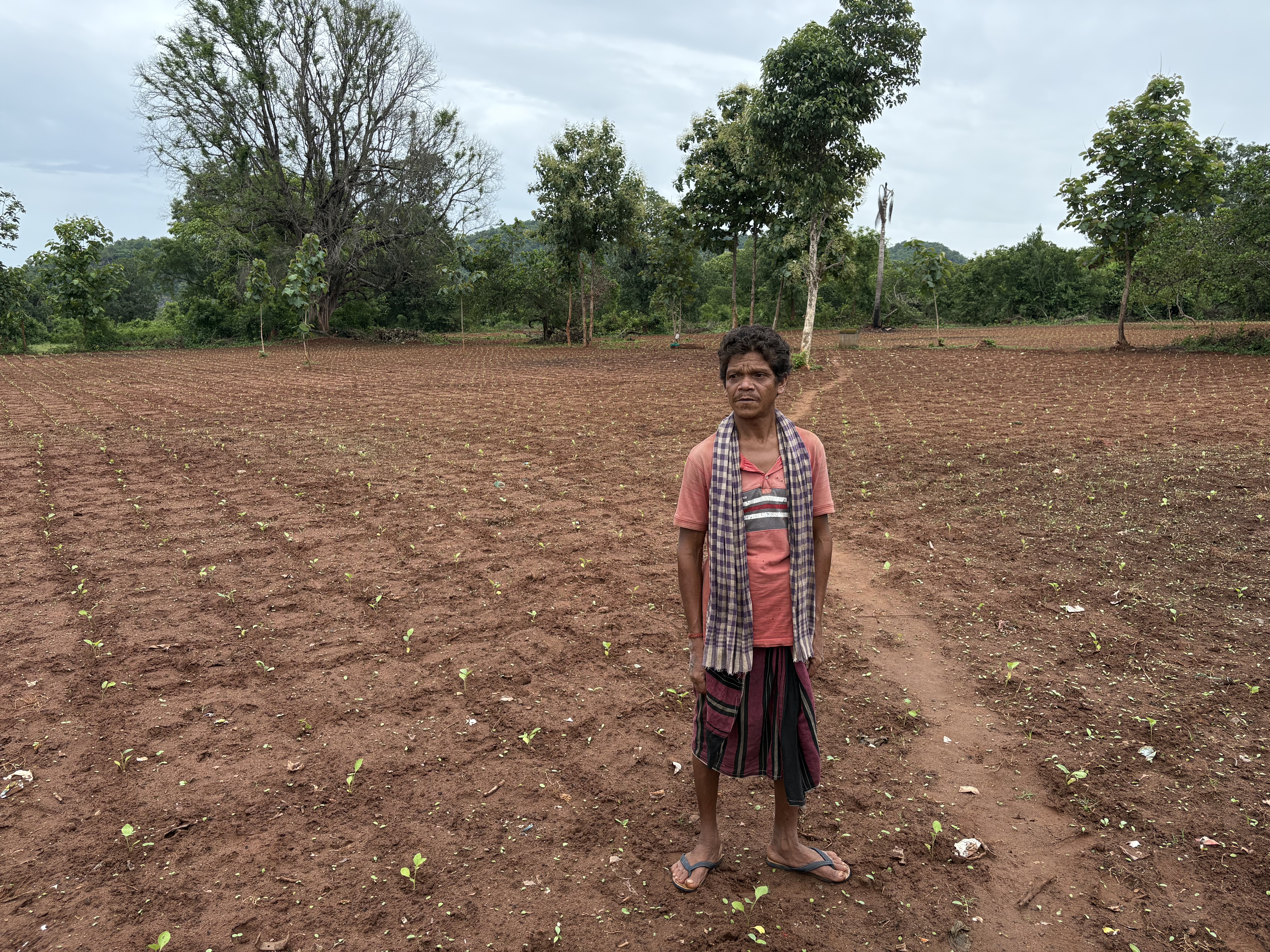
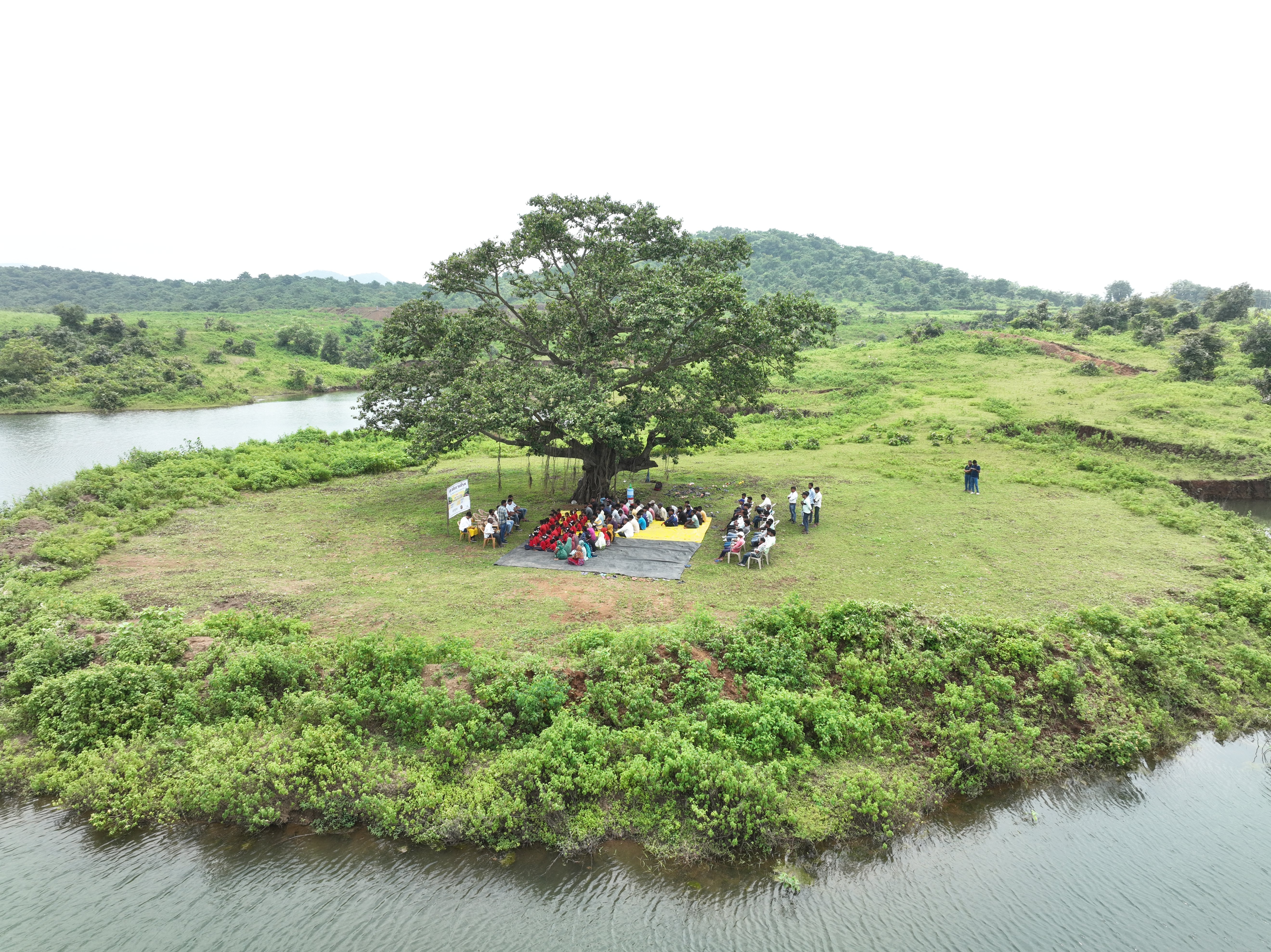
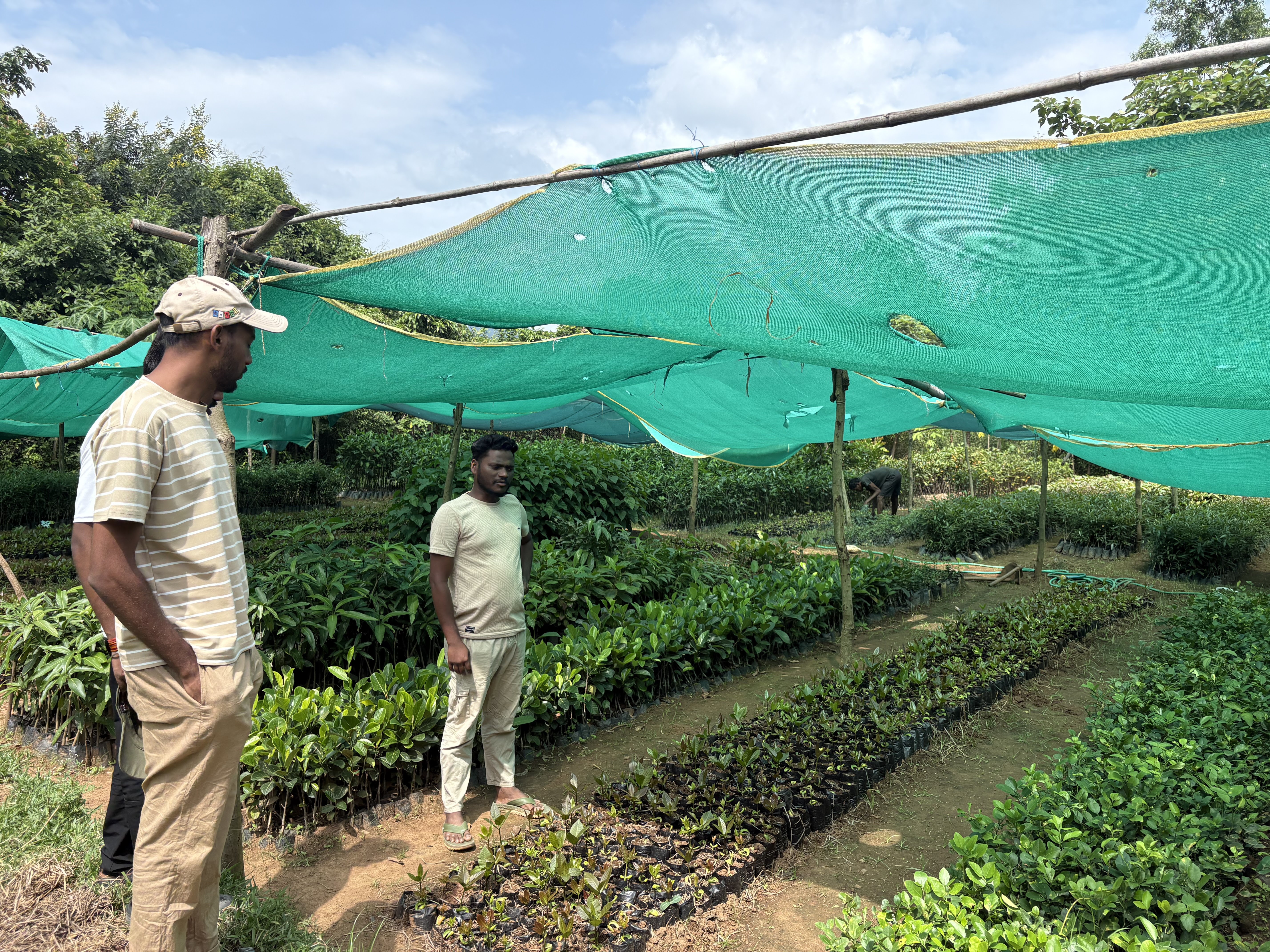
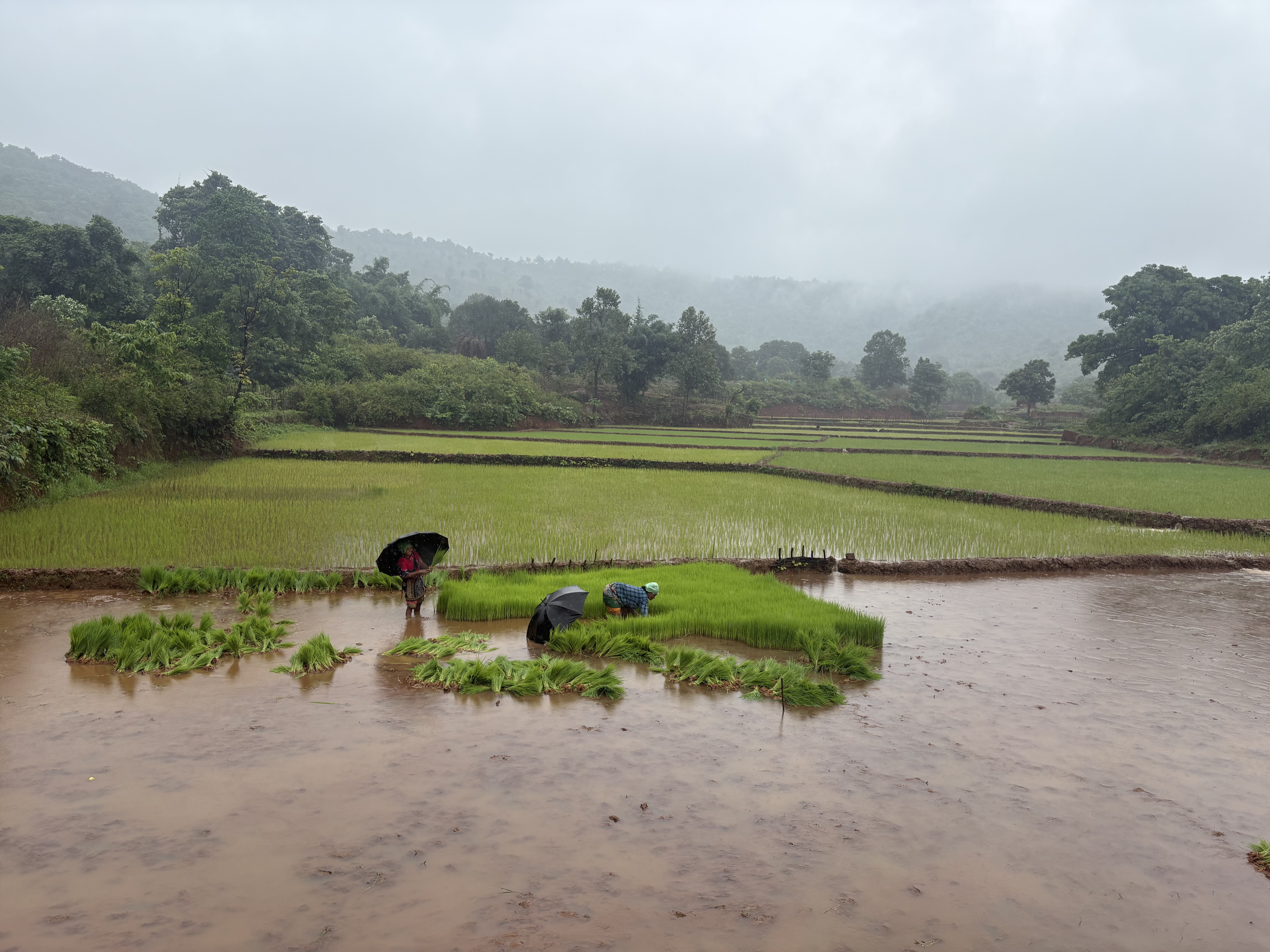
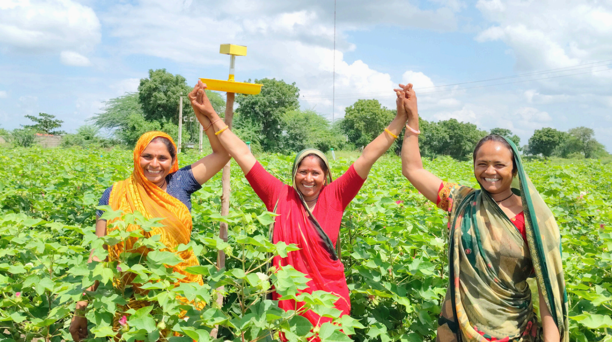
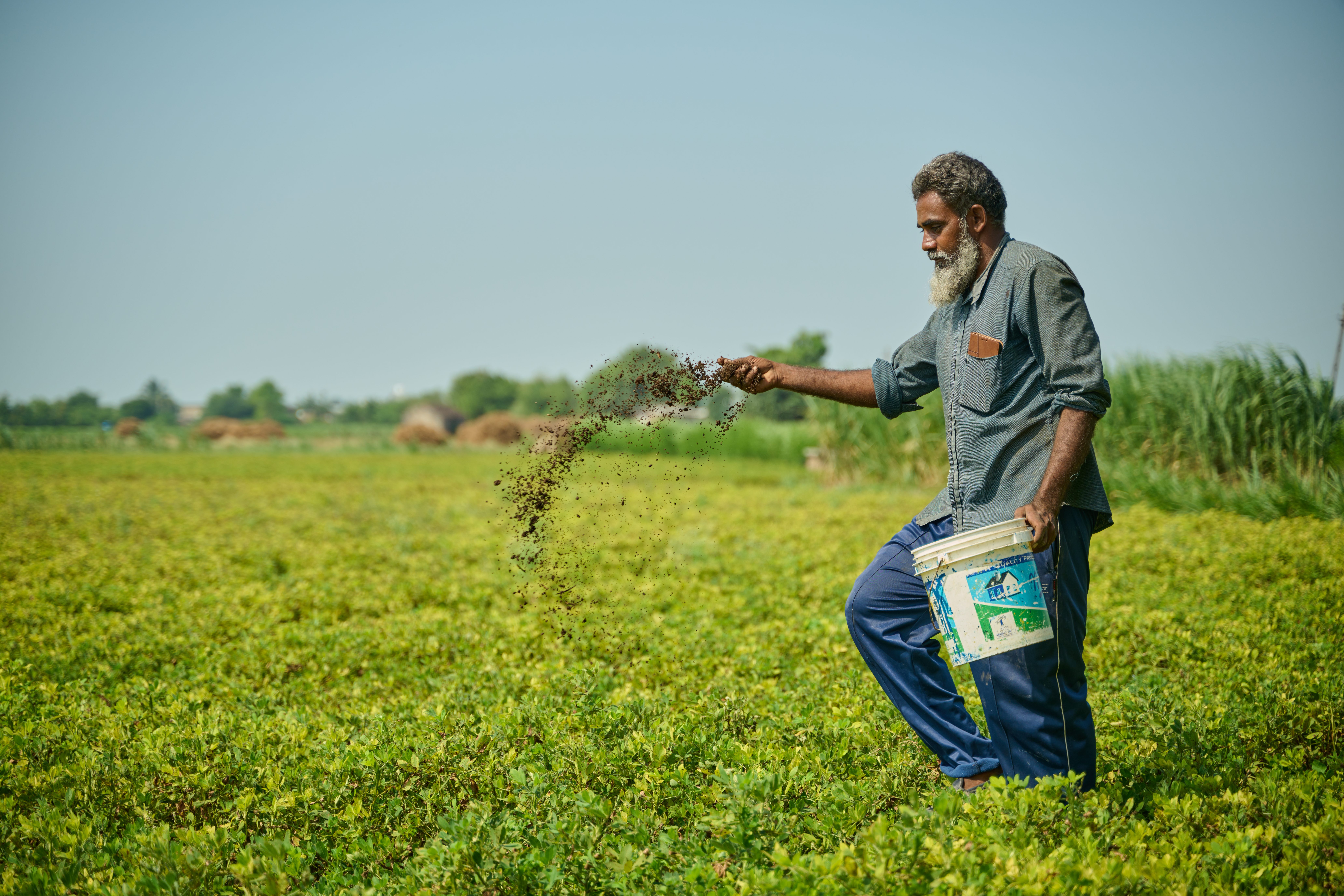
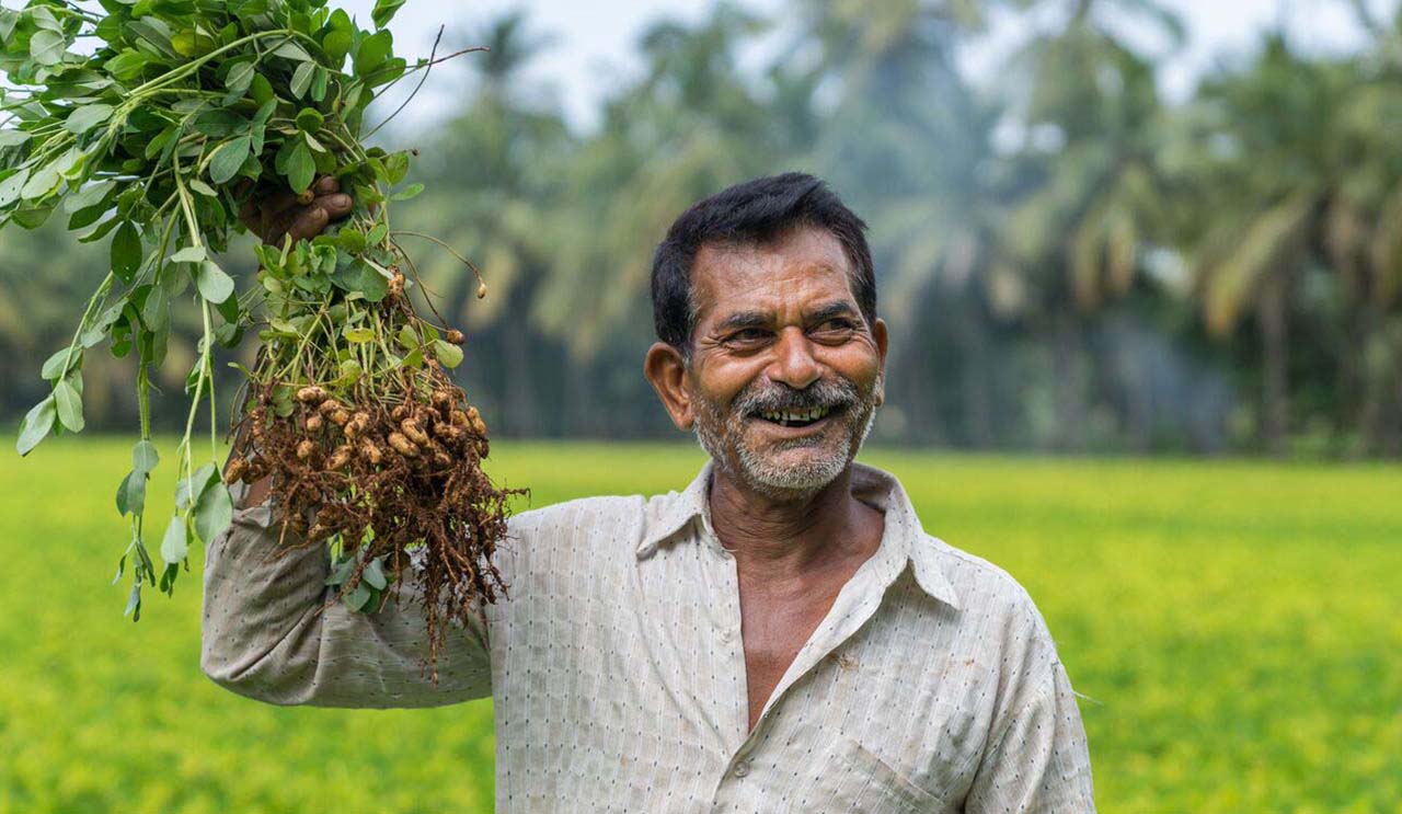
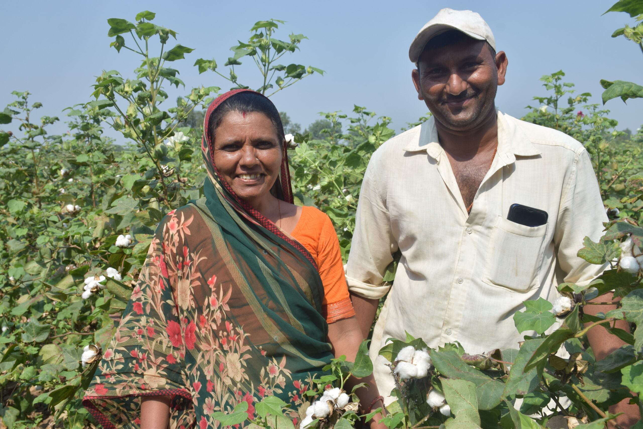
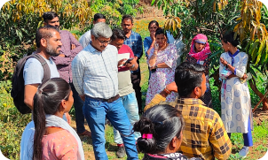
All photography used in public-facing C-GEM materials must carry documented consent from identifiable individuals. Include district and year in captions for audit-grade provenance (e.g. Bundelkhand, Madhya Pradesh · 2024).
08 · Applied Branding [MARKETING] [PLATFORM]
How the C-GEM identity applies to community-facing surfaces: site, brochure, deck, partnership memo. Geist sets structure; Newsreader Italic carries voice; Sprout marks live data.
Methodology docs, transparency dashboards, project registry feeds, API surfaces. Space Grotesk sets structure; JetBrains Mono is the constant background hum. Pure black + Lime. No rounded corners.
01. Programme Accent Map
Each trademarked programme maps to one consistent accent. These are categorical — never swap accents between programmes.
Carbon Ready™
Feasibility reports & climate portfolios for grassroots organisations. Accent: Harvest · #C98A1F.
Carbon Bridge™
Connecting vetted market actors with community projects. Accent: Platform Black · #000000.
Climate Learn™
Workshops, guidebooks, and community trainings. Accent: Leaf Green · #2C7A3D.
Beyond Carbon™
Community stewardship, new methodologies, blended finance. Accent: Clay · #B85829.
02. Marketing Hero Layout
The standard marketing hero: eyebrow + display heading with Newsreader italic voice + stat cells + CTA row. Use on landing pages, programme microsites, and pitch deck covers.
02. Platform Hero Layout
The standard platform hero: Space Grotesk display heading with Lime highlight + metric strip + CTA row. Use on dashboards, methodology docs, and registry interfaces.
03. Marketing Stat Band
Impact numbers the organisation can show its work for. Ink cell anchors the band with context copy; stat cells carry the numbers.
Numbers we can show our work for.
03. Live Metrics Strip
Four audit-grade data cells. Each carries a label in JetBrains Mono, a number in Space Grotesk, and a sync timestamp. The 60–80% community share is always highlighted in Lime.
04. Programme Tile
Audit-grade project card. All fields are machine-readable: ID slug, methodology version, partner role codes, revenue share as a contractual range. No narrative copy.
04. Programme Tile
Standard card layout for active carbon projects. Lead column carries the narrative; side panel holds the partner roster and accountability badge.
Regenerative Cotton. Saurashtra.
Twenty-five thousand stewards on 30,000 hectares, transitioning to regenerative practices alongside AKRSP (India). Community holds 75% of carbon proceeds — codified in contract, not in promise.
05. Verified Carbon Projects Register
| Project ID | Region / State | Focus Area | Hectares (ha) | Primary Partners |
|---|---|---|---|---|
| ID 4458 | Gujarat State, India | Regenerative Agricultural Practices | 45,000 ha | Varaha Climate Ag. · Shroffs Foundation Trust |
| ID 5140 | Madhya Pradesh & Uttar Pradesh | The Biwal Carbon Project | 30,000 ha | Fair Climate Fund India · Gram Vikas |
| ID 4613 | Western Region, Gujarat | Horticulture-Based Cultivation | 12,500 ha | AKRSP (India) · Cohesion Foundation Trust |
| ID 3892 | Rural Odisha, India | Enriching Private & Community Lands | 3,537 ha | FES · FES India Partnership Trust |
09 · When to Use Each Skin [GUIDANCE]
C-GEM has two composition modes. Choosing the wrong skin for an output creates a category mismatch — community-facing material that looks like a dashboard, or audit reports that read like marketing. This section tells you which to reach for and what changes between them.
Human, warm, community-facing
Use this skin for anything that a farmer, CSO, FPO, or funder will read as a persuasive or informational document. It signals organizational warmth and narrative credibility.
- Public website and landing pages
- Partnership memos and pitch decks
- Community-facing brochures and one-pagers
- Programme introduction documents
- Social media assets and event materials
- Funding proposals and grant reports
Type: Geist + Newsreader Italic · Corners: 8px · Accent: Sprout (#C8F47A)
Clinical, data-grade, verification-first
Use this skin for any surface where the primary audience is a technical reviewer, compliance team, carbon credit buyer, or regulator. It signals precision, not persuasion.
- Methodology documents and carbon project filings
- Transparency dashboards and ledger interfaces
- MRV reports and third-party audit submissions
- API documentation and developer-facing content
- Data exports and project registry pages
- Internal compliance and governance papers
Type: Space Grotesk + JetBrains Mono · Corners: 0px · Accent: Lime (#B6F569)
What stays the same across both skins
These rules are non-negotiable regardless of skin. Any output that breaks them is out of brand.
Always green, never recolored. Used as hero anchor, background motif at 6–10% opacity, or inline mark at cap-height. Never applied as decoration.
All figures representing communities, hectares, or credits use Indian format: 2,71,000 —
not 271,000. Apply tabular-nums in any data column.
#2C7A3D anchors the brand in both skins. Programme accents (harvest, clay, ink) are secondary and category-specific.
Replace with a Lucide stroke icon, an SDG tile, or nothing. Emoji degrade the audit-grade positioning of C-GEM in both marketing and platform contexts.
Farmers are stewards and protagonists. Write: communities own, lead, negotiate. Never: communities "receive", "benefit from", or "are served by".
#FFFFFF is the page surface in both skins. The v1 cream (#FDFAF3) is fully retired. --paper-tonal (#F6F7F2) may be used for section breaks only.
If in doubt, ask: who reads this first?
If the first reader is a farmer, an FPO officer, a CSO partner, a journalist, or a funder reviewing a proposal — use the Marketing skin. If the first reader is a carbon credit buyer, a methodology auditor, a regulator, or a technical reviewer — use the Platform skin. Documents that serve both audiences should default to Marketing skin with Platform-style data tables embedded within.
10 · Developer Code & Asset Index [CODE]
Use these quick links to copy asset paths or integrate token-aware structures directly into your components.
01. Asset Paths Quick Copy
| Asset Name | Relative File Path | Action |
|---|---|---|
| Primary Stacked Color Logo | assets/logos/stacked-full-colour.png | |
| Core Brushmark Icon | assets/logo-brushmark.png | |
| The Ambassador Coin sketch | assets/illustrations/ambassador-sketch.png | |
| Tokens Stylesheet Path | ../colors_and_type.css |
02. HTML Boilerplate Integration
To initialize a standard C-GEM project page, pull in the CSS variables and setup the standard layout container.
<!-- Include C-GEM variables stylesheet -->
<link rel="stylesheet" href="c-gem-design-system/project/colors_and_type.css">

<!-- Apply .platform-skin class to body for audit/dashboard applications -->
<body class="platform-skin">
  <header>
    <span class="eyebrow">[01] · carbon ready™</span>
    <h1 class="display">Empowering Grassroots Livelihoods</h1>
  </header>

  <div class="triplet">
    <span>People-centric</span>
    <span>Tech-enabled</span>
    <span>Planetary-scale</span>
  </div>

  <div class="stat">
    2,71,000 <span class="unit">growers</span>
  </div>
</body>